Advertising brand logo design is a form of communication with consumers in marketing. Regardless of the media, the creative ability is mainly reflected in the following three steps:
1) Creative ability of communication strategy
2) Refining the creative ability of the concept
3) Creative ability to design execution

Brand logo design symbol creative thinking is the creative thinking ability required for design execution in the third step. From the perspective of visual semiotics, in this step, the designer is mainly doing translation work—translating the language concept of information (that is, the sentence to be conveyed in the advertisement) into visual symbols.

Advertising communication concept (language text) = visual communication concept (visual picture)
Language vocabulary = visual symbol (visual vocabulary)
Language logic = isomorphism of visual symbols
Whether the designer's performance is executed or not, look at:
1) Your vocabulary translation
Finding the right visual symbols (vocabulary) from the vocabulary of words, here is mainly the ability to divergence and convergence. Divergent thinking is to find more diverse and unique visual symbols (vocabulary). Convergence thinking is to screen out which symbol is more suitable. Whether the visual symbol features you use are accurate, related to the audience, can quickly and accurately understand the language vocabulary in the concept. 2) Your isomorphism
"Brand logo design visual symbol isomorphism" is "visual logic", although visual logic can not strictly correspond to language logic, and the order of visual vocabulary in the picture depends on the viewer's viewing order, which is also related to reading or The order of the vocabulary heard is not the same, but the visual symbolic isomorphism does affect the audience's interpretation of the advertisement and the understanding of the content of the communication concept, mainly because the interpretation of visual logic depends on our visual experience.Which language logic is suitable for which language logic? Thereby ensuring the effectiveness of communication.
3) Your visual expression style

The "performance style" we are talking about is actually the tone of the advertising picture, which is different from the "expression style" of the communication concept.
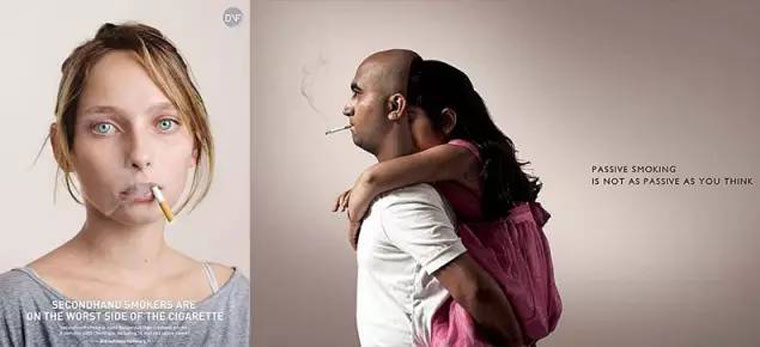
The performance style in the design execution stage means that after the concept and symbol of communication and the symbolic isomorphism are determined, it is necessary to make a reasonable guidance on the emotional association of the audience (right brain) through the form, color, texture and other tones of the visual image. In order to allow the audience to understand the meaning more accurately. If the same isomorphism, the expression style (toned), the audience may not be in the dark when it is interpreted. The following are posters of two comedy movies, all of which are different.
You may have seen that the symbolic isomorphism here only translates the concept of the logical focus of the concept of "feeding smoke", just a keyword. But if you don't read the auxiliary text in the poster, the audience can't read the tone of "questioning" and can't read the identity hypothesis of "your (child)". Auxiliary text modification defines the body of the message, just like the adjective and the auxiliary word of a sentence. For the relationship between text and graphics in the poster, both are to better convey the concept of communication, which is light and heavy, whether to add or not, depending on whether the audience can understand it. It depends on the designer's ability to control symbolic semantics and pragmatics

The meaning of the brand logo design visual symbol has divergent characteristics, so in addition to the information such as the subject and the guest, it also needs a lot of adjectives, prepositions and other auxiliary. Look at the posters with a simple communication concept: although the text symbols are also part of the visual symbol category, the interpretation of text and images is not the same in people's interpretation habits. As a visual expression symbol of language, the word symbol has its complete symbol system (such as Chinese and English). People have a clear language reference model for the understanding of "words, articles, sentences".
However, for visual languages such as graphic images, there is no complete symbolic system. Moreover, the uncertainty of the order when the reader is watching, the interpretation of graphic image symbols has a lot of randomness, which requires text symbols to be limited because Designers must first ensure that the information is delivered accurately.

Support Hotline:186-8877-7094